A website that enables locals and visitors to own a piece of Detroit memorabilia
e-Commerce Website Redesign
2 WEEK SPRINT
Business
Pure Detroit
Pure Detroit
Operations
Remote/online
Remote/online
Role
Research
UX Design
UI Design
Research
UX Design
UI Design
Tools
Sketch
Adobe iD, Ai, Ps
Miro
Quicktime Player
Powerpoint
Sketch
Adobe iD, Ai, Ps
Miro
Quicktime Player
Powerpoint
Research Methodologies
Research Plan & Discussion Guide
Heuristic Evaluation
User Testing - Task Analysis
Competitive & Comparative Analysis
Card Sorting
Low Fidelity User Testing
High Fidelity User Testing
Research Plan & Discussion Guide
Heuristic Evaluation
User Testing - Task Analysis
Competitive & Comparative Analysis
Card Sorting
Low Fidelity User Testing
High Fidelity User Testing
Original
Problem
Pure Detroit requires an improved e-commerce website. They want to showcase their products, while maintaining the current brand image appeal.
Heuristic Evaluation
What Improvements are Required?
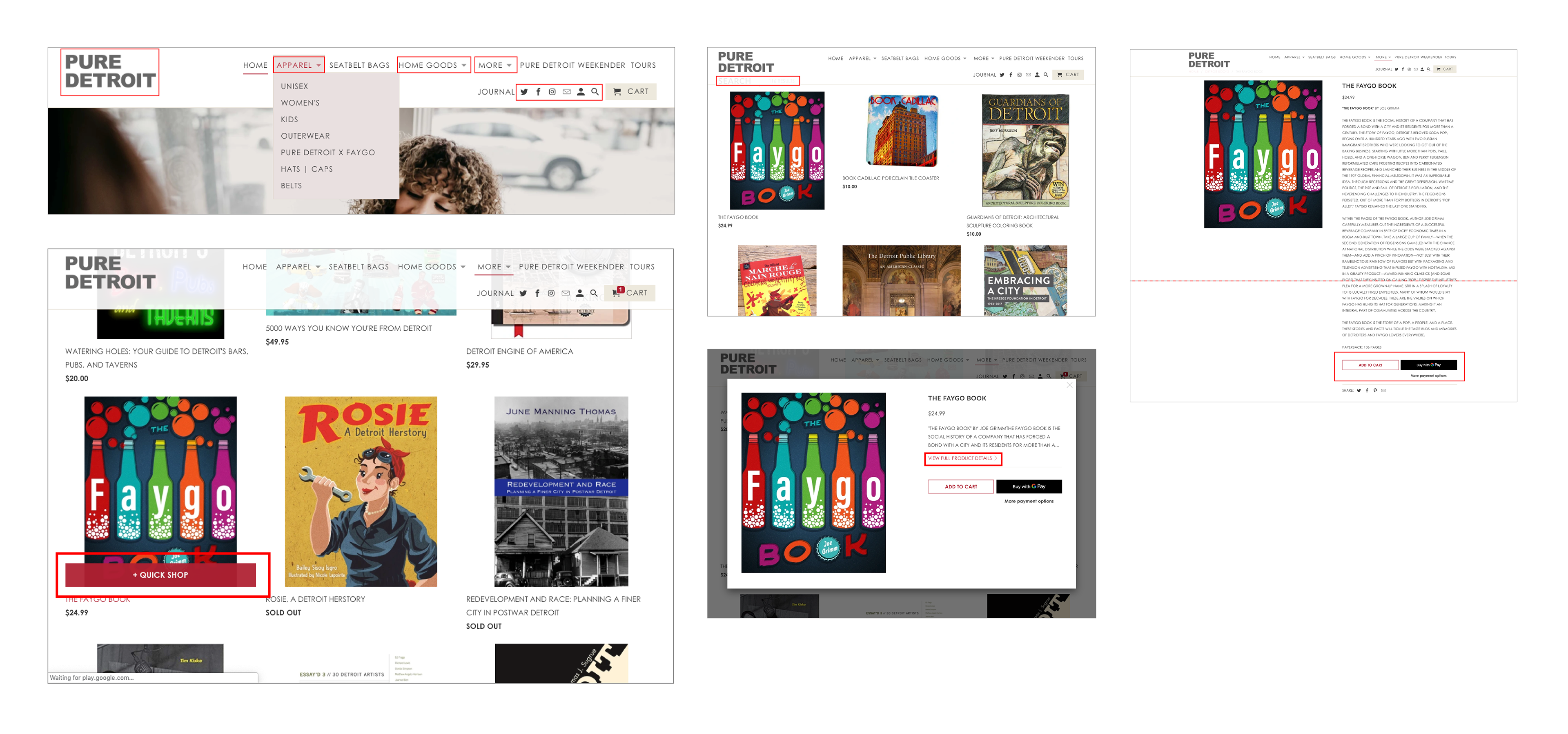
By conducting a Professional Evaluation on PureDetroit.com I was able to discover and learn what usability concerns existed.
Some of the key violations surrounded efficiency and learnability:
- Old logo in use
- Indescript dropdown menu categories
- Inactive links
- Small icons
- 'Quick Shop' buttons that were not quick
- Excessive product description text
- Scrolling to locate key buttons such as 'add to cart'
- No secondary navigation - product filtering
Task Analysis
User Testing PureDetroit.com
The key goal for an e-Commerce site is to sell products. The primary function for a user is to purchase a product and pay for it. Therefore, I set up user test, task analysis for 3 users to assess and evaluate the usability to simply locate a product, check it out and contact the business.
The data collected from the usability tests highlighted four key takeaways:
The data collected from the usability tests highlighted four key takeaways:
"...I wasn't sure who they really were."
"Navigation wasn’t very clear... nor the categorisation."
"Poor visual cue indicators. Especially item that are SOLD OUT!"
"Contacting them wasn't very obvious."

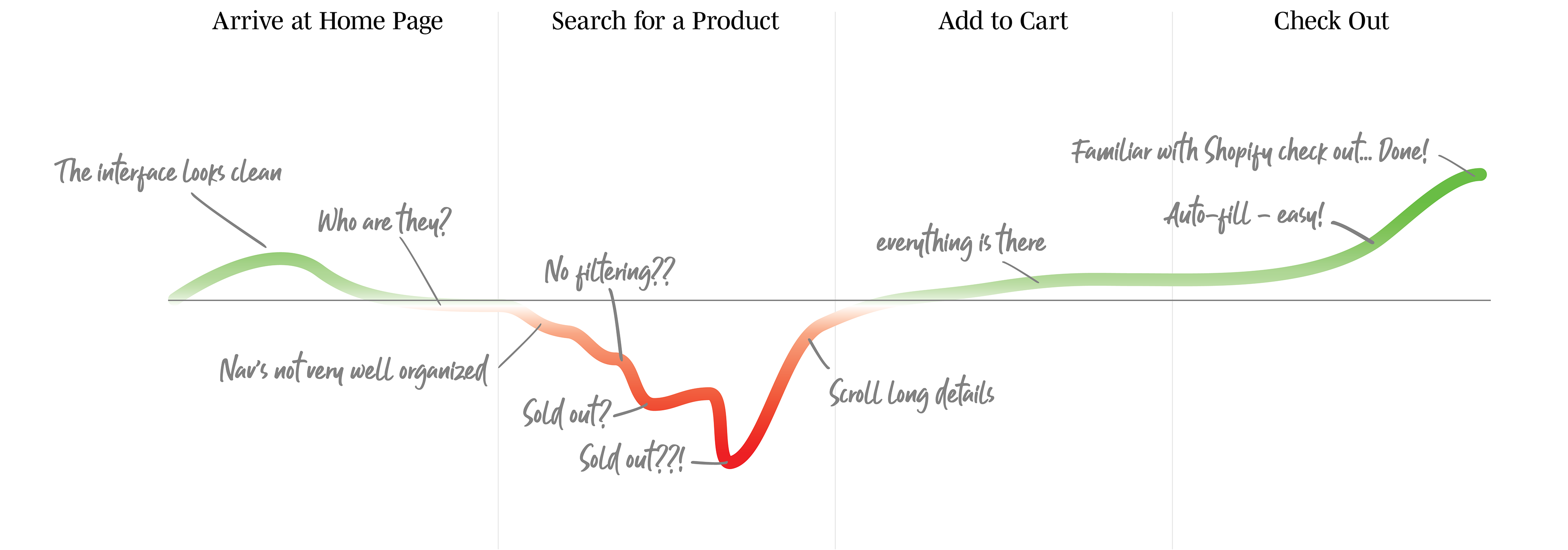
Journey Map
User Satisfaction
After collating and synthesising data from the Professional Evaluation and User Tests I developed a Journey Map to identify key phases, where the pain points existed and where to capitalise on opportunities. The below visual made it very clear what phase needed to be addressed to increase efficiency and user satisfaction.
C&C Analysis
Assess Competitor
e-Commerce Sites
e-Commerce Sites
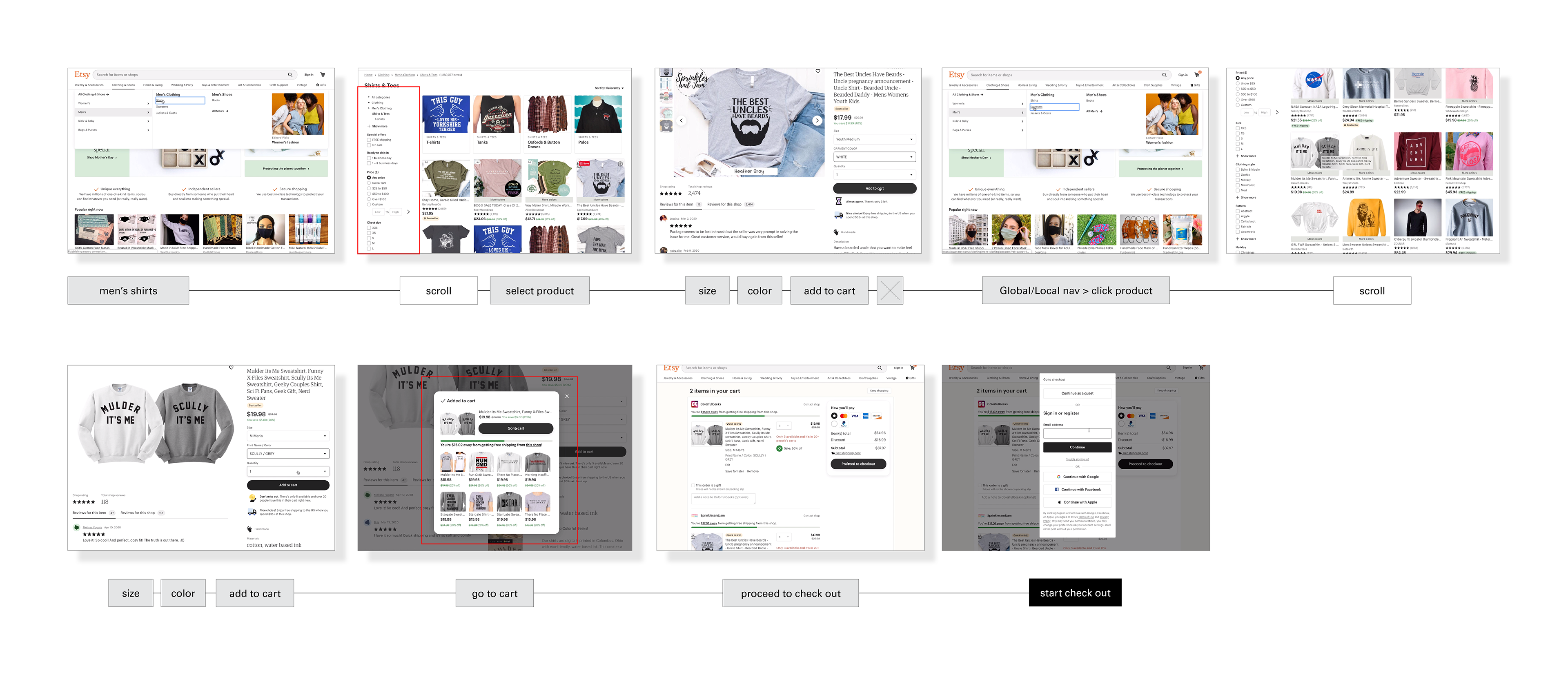
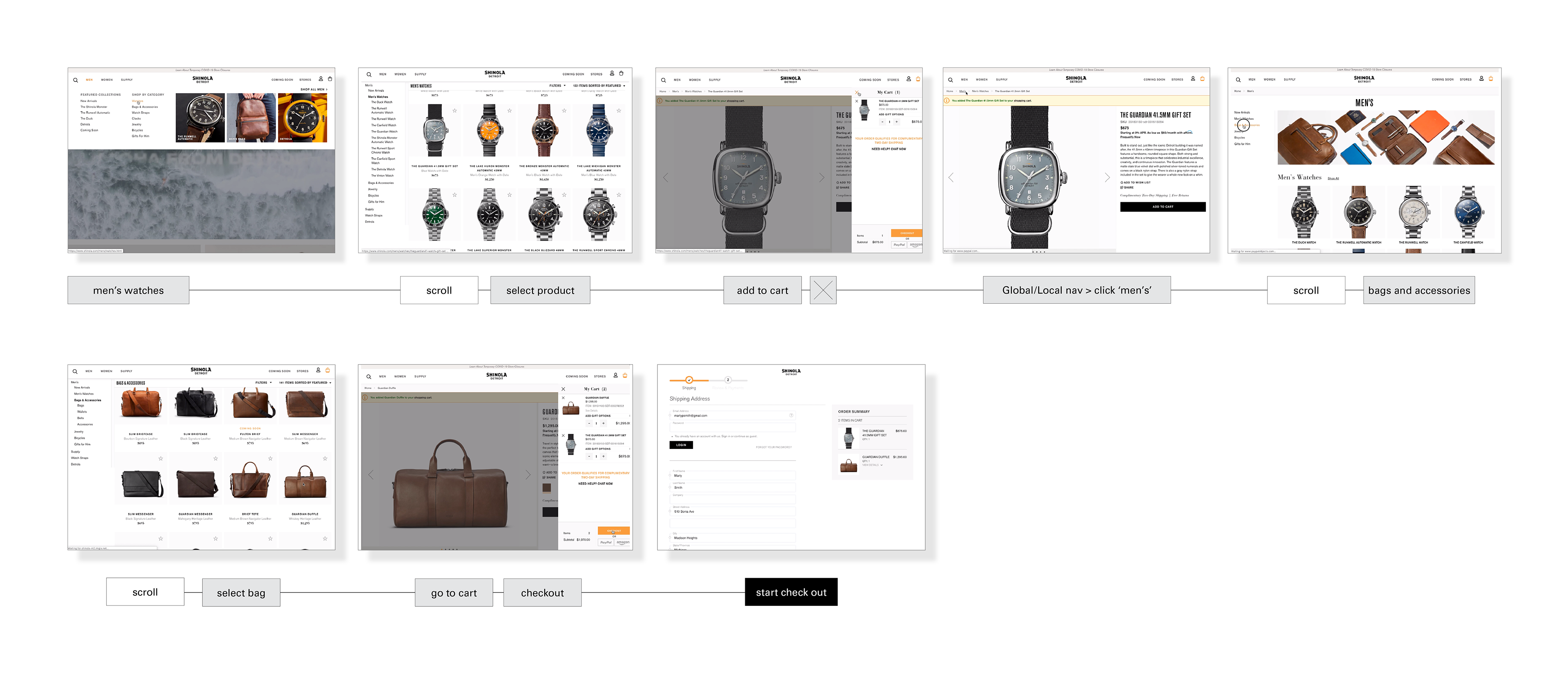
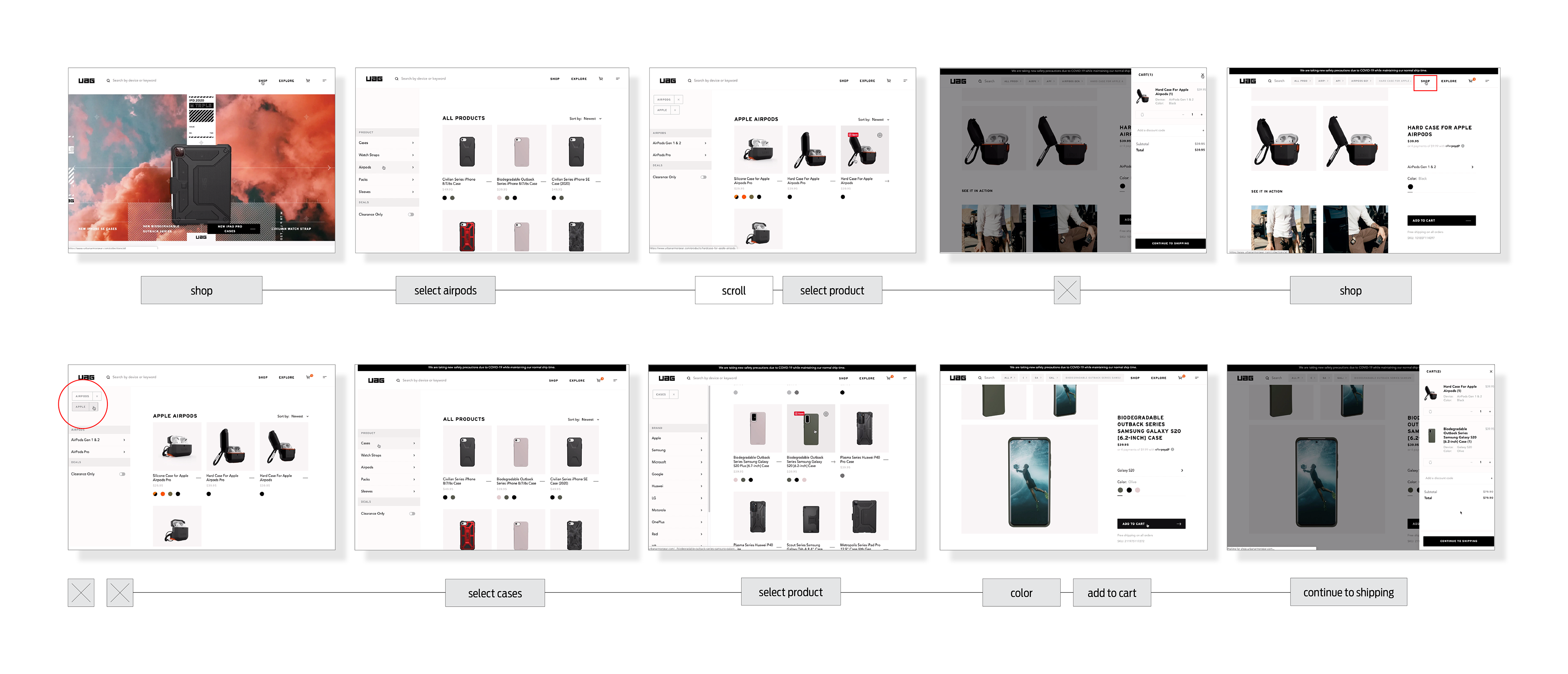
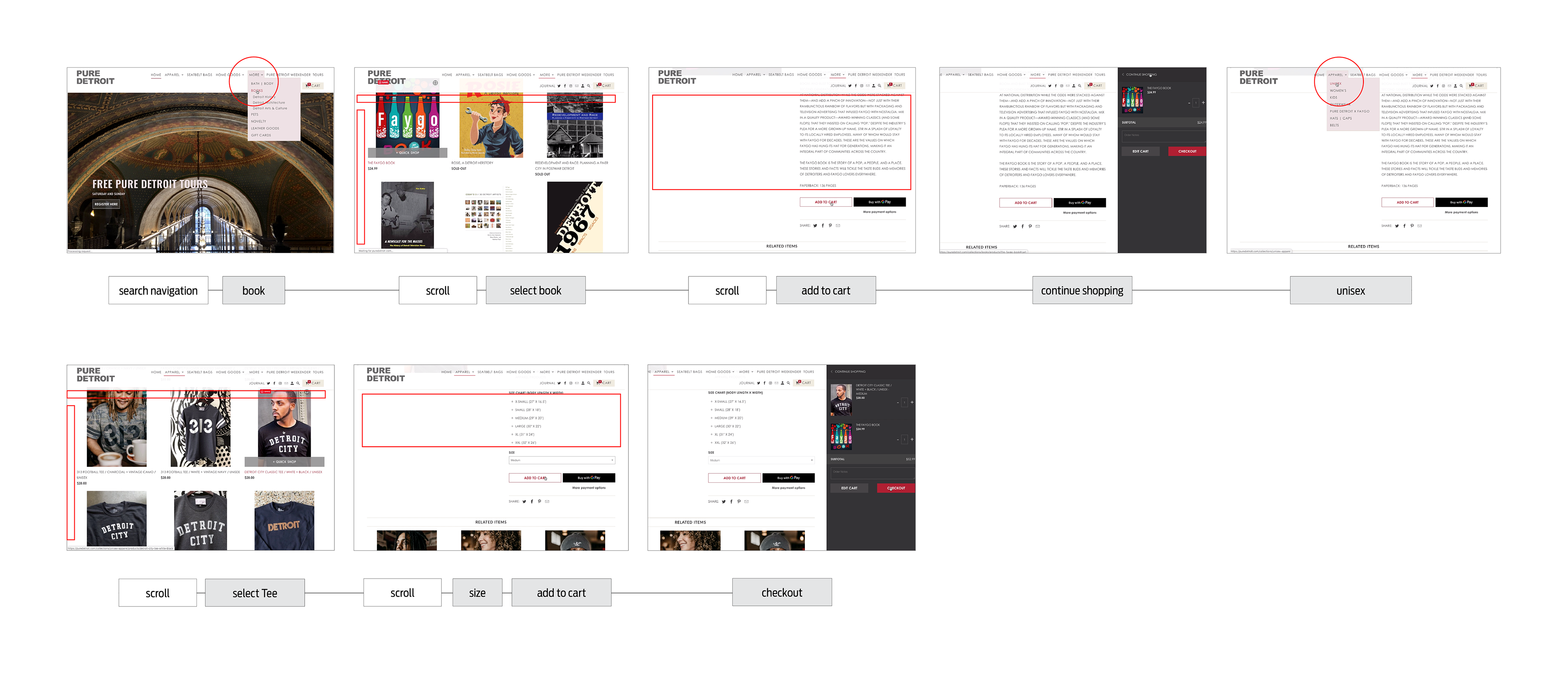
A significant part of the research process often involves a competitive and comparative analysis.
In addition to PureDetroit.com I selected three other varied e-commerce sites to test:
1. Etsy.com (mainstream business with high volume inventory)
2. Shinola.com (high-end products with medium volume inventory)
3. UrbanArmorGear.com (high-end tech protections accessories with low volume inventory)
2. Shinola.com (high-end products with medium volume inventory)
3. UrbanArmorGear.com (high-end tech protections accessories with low volume inventory)
The required task was to add one product to the cart, then another seperate product and check out at a leisurely pace.
The three competitor e-commerce businesses gave insights into design and functionality trends, pain points, navigational systems employed, plus general benchmarking.
Additionally, I documented clicks, scrolls, pain points and total time taken to compare and understand how process, functionality and visual design can increase satisfaction and efficiency.
Etsy.com
CLICKS: 12
SCROLLS: 2
PAIN POINTS: 1
TIME: 2min 53sec
CLICKS: 12
SCROLLS: 2
PAIN POINTS: 1
TIME: 2min 53sec
Shinola.com
CLICKS: 9
SCROLLS: 3
PAIN POINTS: 0
TIME: 1min 29sec
CLICKS: 9
SCROLLS: 3
PAIN POINTS: 0
TIME: 1min 29sec
UrbanArmorGear.com
CLICKS: 12
SCROLLS: 1
PAIN POINTS: 1
TIME: 2min 35sec
CLICKS: 12
SCROLLS: 1
PAIN POINTS: 1
TIME: 2min 35sec
PureDetroit.com
CLICKS: 9
SCROLLS: 4
PAIN POINTS: 6
TIME: 1min 38sec
CLICKS: 9
SCROLLS: 4
PAIN POINTS: 6
TIME: 1min 38sec
I learnt that Mega-Navigation systems are trending as they reduce clicks and search time, meanwhile holding large volumes of content.
The data indicated that clean alignment, proximity and contrast can increase browse efficiency & user satisfaction.
Open Card Sorting
Product Categorisation
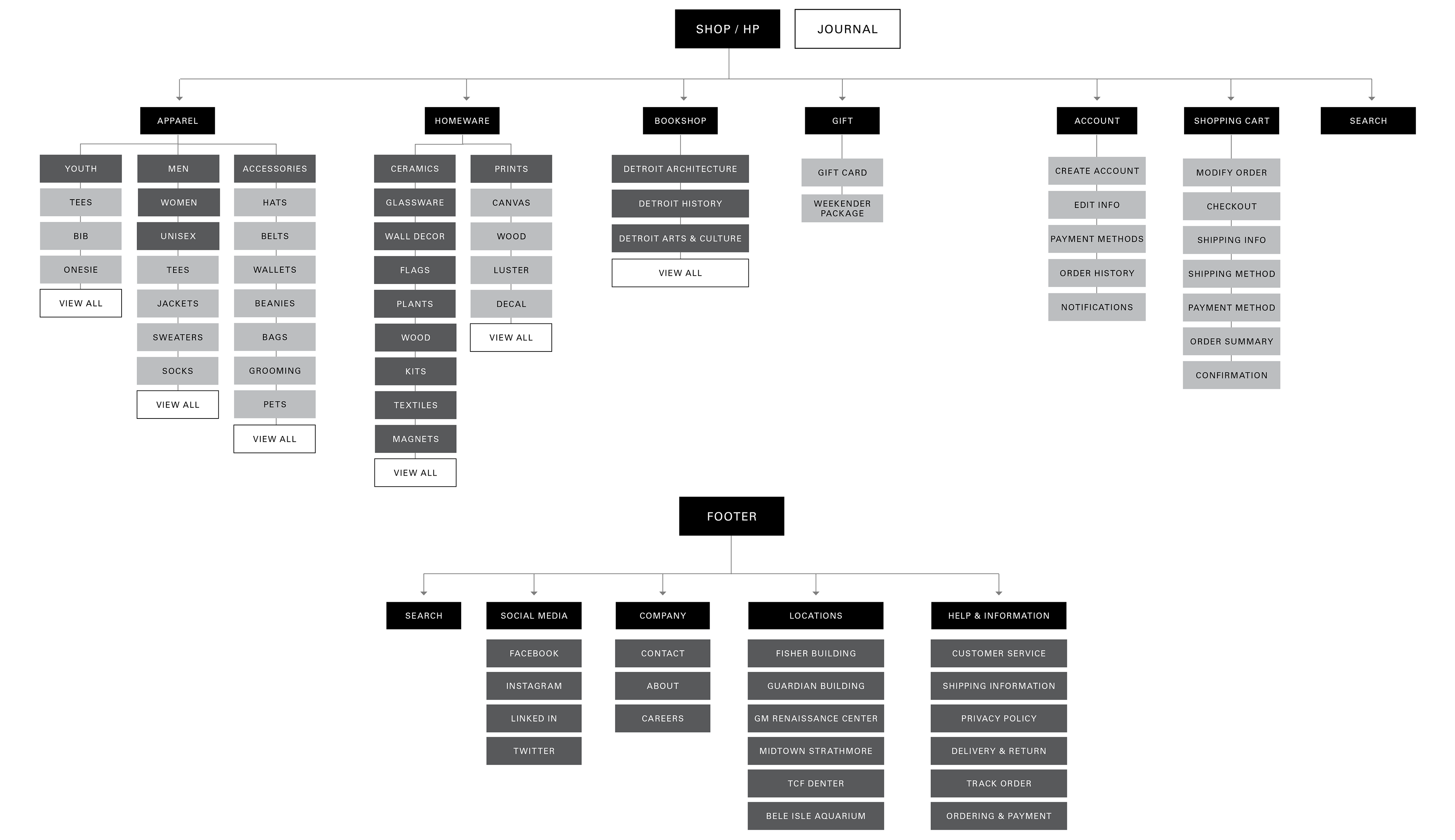
To address the global navigation confusion which surfaced in earlier user testing, I employed a research methodology called Open Card Sorting. This enabled myself to observe x6 users sort through the full range of products available on PureDetroit.com, then group them into categories.
The goal was to identify overlapping themes and patterns of product categorisation to implement into the global navigational system and help build a site map.
The goal was to identify overlapping themes and patterns of product categorisation to implement into the global navigational system and help build a site map.
The research indicated that all products could be narrowed down to 4 drop down menus in the global navigation - apposed to the original 6 that confused users in the testing phase.
Home / Apparel / Seatbelt Bags / Home Goods / More / Tours
Apparel / Homeware / Bookshop / Gift
The card sorting data was instrumental in establishing primary, secondary and tertiary product classifications.
Future
Site Map
The data collected from the Open Card Sort structured the information architecture.
Fortunately, the users' mental models displayed enough overlap to categorise primary, secondary and tertiary levels to assist in the Site Map development.
Fortunately, the users' mental models displayed enough overlap to categorise primary, secondary and tertiary levels to assist in the Site Map development.
Problem Statement
HMW Statement
Pure Detroit's Problem
How Might We Statement
PureDetroit.com needs to establish clearer, effective navigation & visual cues as there are too many misunderstandings and pain points when attempting to locate products. Online sales have been on a decline and revenue needs to increase.
How might we improve PureDetroit.com’s navigation to efficiently locate products and improve visual cues to boost overall customer satisfaction?
Low Fidelity Prototypes
Design Development & User Testing Time
Synthesising and collating all the research data drove the initial low fidelity design development. From rough, paper sketches to a more refined digital format, User Testing gave invaluable insight into a range of inconsistencies and pain points.
Throughout all lo-fi testings the users were tasked to:
1. Find the 'men's sweatshirt' page
2. Filter the products to a 'large' size
3. Sort products by price
4. Select a product
5. Choose a color
6. Add the item to your cart
7. Check out
2. Filter the products to a 'large' size
3. Sort products by price
4. Select a product
5. Choose a color
6. Add the item to your cart
7. Check out
Several rounds of iterations included key changes in progress indicators, close/back buttons, labelling consistencies, proximity adjustments and faceted nav modifications.
Low Fidelity Paper Prototype

Low Fidelity Digital Prototype
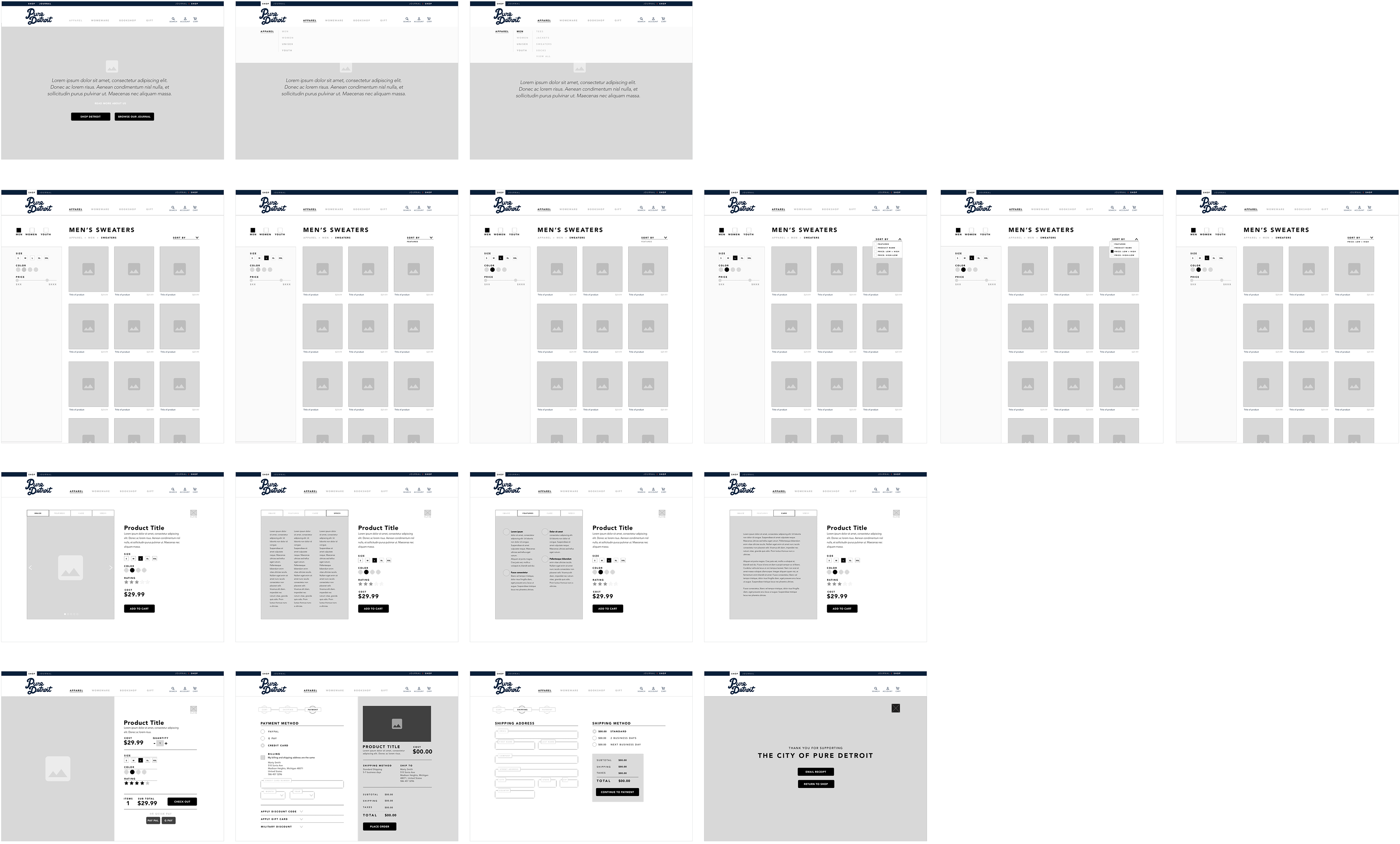
High Fidelity Mockup
Bringing it to Life
Following the low fidelity iterative process it was time to polish the design by injecting color, typeface, imagery and micro copy.
Color

The color pallet was inspired by Detroit's iconic pro baseball team the Detroit Tigers. Being such a prominent team in the city's history and the city famously known for it's blues, it felt a fitting choice to represent PureDetroit.com. Predominantly all white with two darker blues accompanied by a vibrant orange accent was a simple, conservative choice that didn't detract from the primary focal point - products.
Typeface

The typeface Avenir was selected as it displays a very clean, contemporary letterform that has a reputation for good readability and legibility - even at a small point size. The versatility of Avenir to effectively read as body copy, headers, buttons and small 'signifiers' was also very appealing.
Imagery

The imagery used should include iconic photographs of downtown Detroit to remind users of the great city. Additionally, it aims to create a sophisticated, contemporary feel to the interface design.
Micro Copy
All copy included should be simple and informative throughout the user's journey - jargon and industry terminologies should be avoided to cater for a broad demographic. The tone should be conversational where appropriate to create a more human experience.
Tab Navigation
Product Information Display Concept
The previous Competitor Task Analysis and additional navigational research inspired a display concept. Competitor's product information pages required users to scan and scroll, creating inefficiency. This made me think...
How might we display all relevant product information in one compact space?
Similar to the popular mega-navigation, I designed a tab structure which allows users to quickly hover over to reveal the desired product information. This solved the problem of user needing to scroll to reveal.

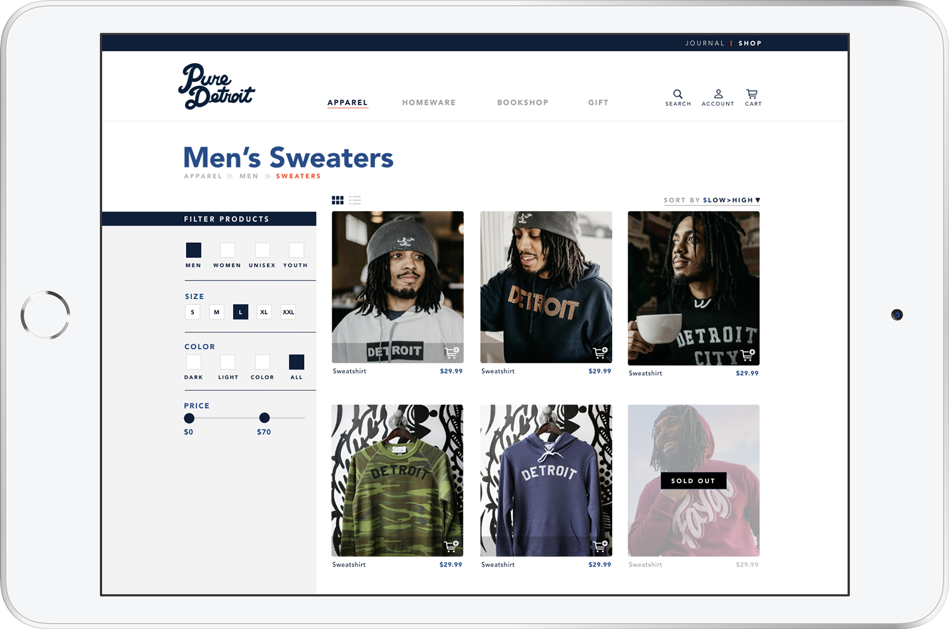
Faceted Navigation
Including Product Filters
The early User Testing, Task Analysis on PureDetroit.com told us that locating products was a pain point. This was no surprise as the original site did not provide a product filtering system - an essential e-Commerce navigational feature.
Adding the faceted navigation in early design development was welcomed in the user testing phase with minor refinement during iterations.
Primary filters included:
- Gender
- Size
- Color
- Price
- Gender
- Size
- Color
- Price
Solution Statement
The research conducted revealed issues surrounding navigation & visual cues. From paper prototypes through to a high fidelity mock-up, user feedback and iterations weeded out the identified inefficiencies and pain points. The path to search and purchase products has been tested and confirmed an efficient, seamless experience.
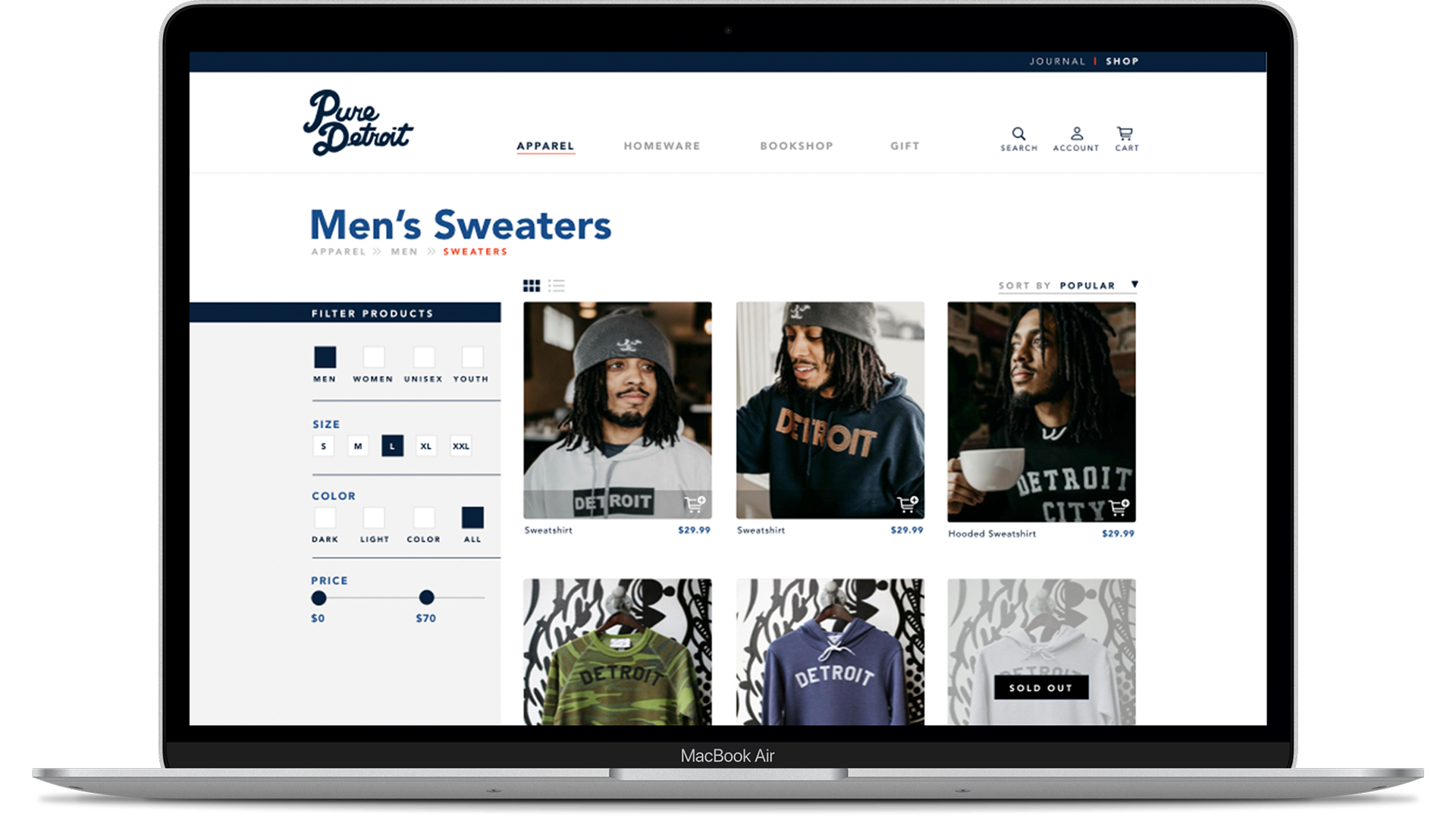
High Fidelity - Digital Prototype
Interactive Prototype
Click in the below image and attempt to purchase a men's sweater.
I hope you find what you're looking for and have a seamless check out experience. If not - i'd love your feedback.
Next Steps
Consult with client to approve navigational structures + branding & identity
Create a style guide to enforce consistency throughout website and visual communications
Research animations/interactions/roll-overs to implement
Investigate & consider gamification
Discuss the activation and development of the 'Journal' section
Footer